A marketing site that already looks like a real bank.
This is the page people see first, before they ever sign up. It has a full homepage, a menu that shows off every service, a live chat button, and a clear "Get Started" button that leads straight into sign up. It was not added on as an afterthought. It was built to be the front door of the bank.

Password gets you close. The PIN gets you in.
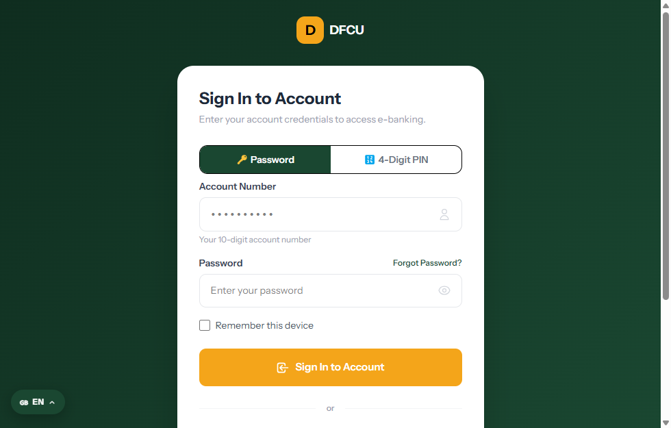
Every login checks the password first, then asks for a six digit PIN before the dashboard opens. If someone logs in from a new device, the system flags it and asks for extra verification. Every login is also saved to an activity log showing the IP address, browser, and device, so customers can check it themselves.

Fifteen plus account types. A phone field that actually works.
Sign up covers a profile photo, personal details, and a proper country code picker on the phone number, so text messages actually arrive. New customers can choose from savings, business, crypto, and more than a dozen other account types. They also set a transaction PIN, answer two security questions, and confirm their email with a six digit code. Every step is fully designed and checked, with nothing left half finished.
Balance, quick actions, and live activity. This is how a modern bank app should open.
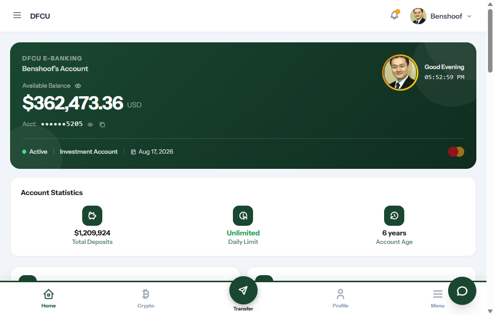
The account balance sits right at the top. Quick action buttons put transfers, bill payments, and cards one tap away, and the transaction feed updates as things actually happen. This is not a picture pretending to be a product. Every number you see comes from a real database.
This is a script, not a service you're renting.
You own the source code. You can deploy it anywhere and rebrand it for every client, without asking anyone for permission. What you are looking at right now is exactly what gets handed to you. It is not a demo account sitting on someone else's server.
Local, bank to bank, and international transfers, guarded by a one time code.
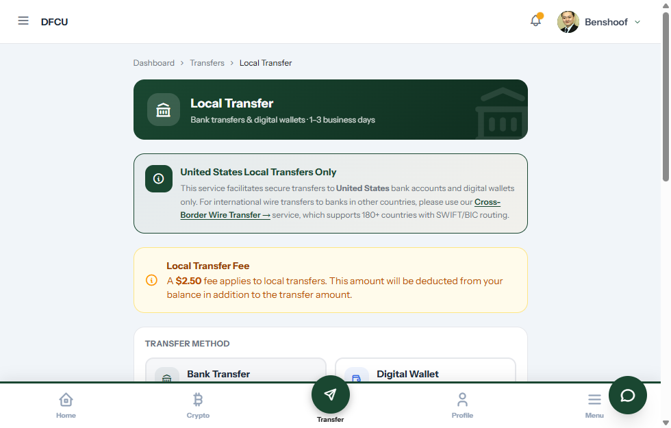
Customers can look up a recipient, choose a bank by country, review a full confirmation screen, and confirm with a one time code before any money actually moves. If a transfer fails or gets stuck, it does not just disappear. There is a proper recovery flow to fix it.
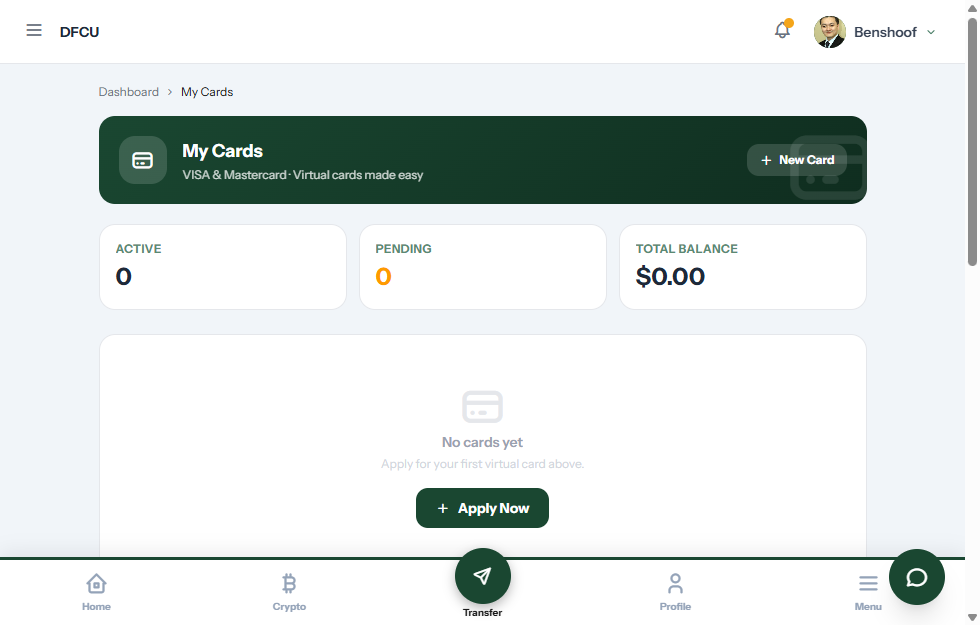
Real looking card designs, with a PIN standing between anyone and the full number.
It comes with Visa and Mastercard style designs and a built in request flow. The card number stays hidden until the customer enters their PIN to reveal it. Each card also has its own transaction history and a top up option.
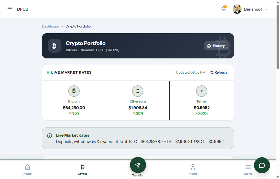
Bitcoin, Ethereum, and USDT sitting next to the regular balance like it's normal.
For a lot of customers today, that is exactly how it should feel. They can deposit, withdraw, and swap between coins right inside the same dashboard as their checking account. No separate app. No second login.
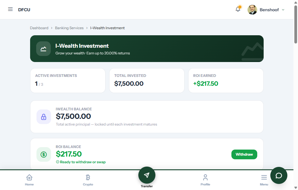
A real investment product, where the returns pay out on their own.
Customers choose a plan, lock in an amount, and watch their returns get added automatically as they come due. No one on your team has to process it by hand. The maturity date updates in real time, right on the same dashboard.
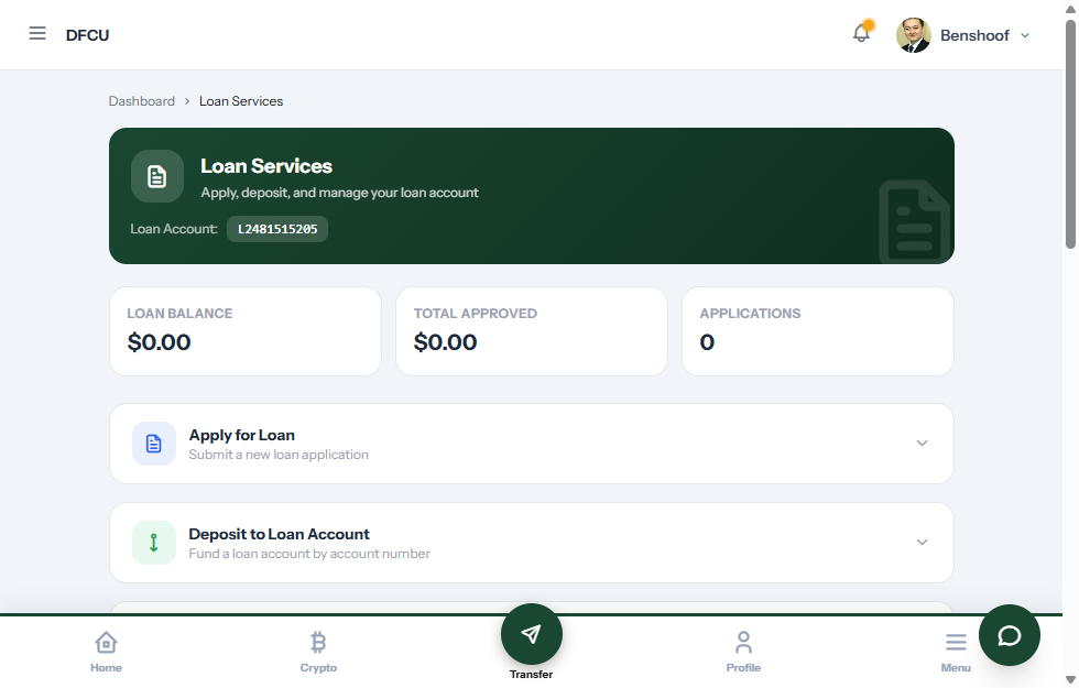
Apply for a loan, get the money, and repay it, all without leaving the dashboard.
There is a complete loan flow built in, covering the application, lookup, and repayment. Customers can pay into their loan or move funds back to their account directly. Lending is not something you have to add on later.
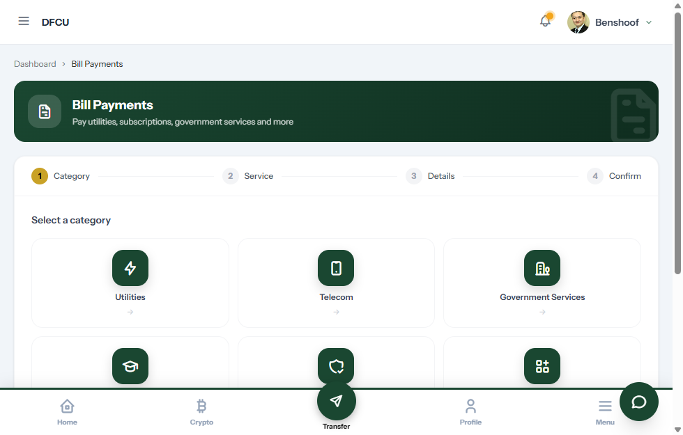
Utilities and services, paid from the same balance, with a real history.
The bill payment form changes its fields depending on the provider, handles the submission, and keeps a full payment history. It is not a flashy feature, but it is the one real bank customers use every single week.
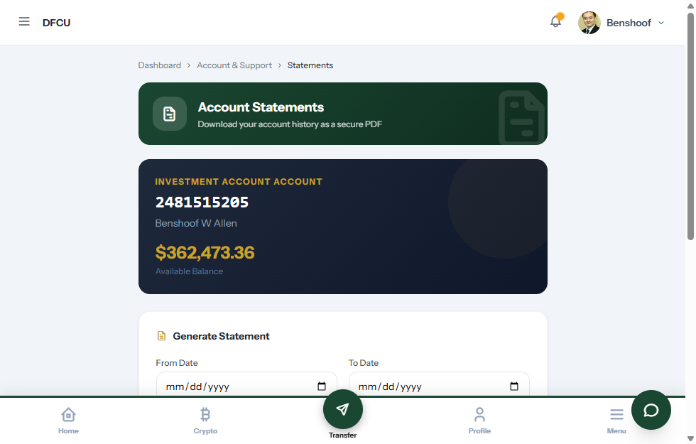
A real PDF statement generator, not a "contact support" dead end.
Customers choose a date range and generate their own branded PDF statement right away. They do not have to wait on your back office or send an email and wait for a reply.
Saved recipients and favorites, so the second transfer only takes ten seconds.
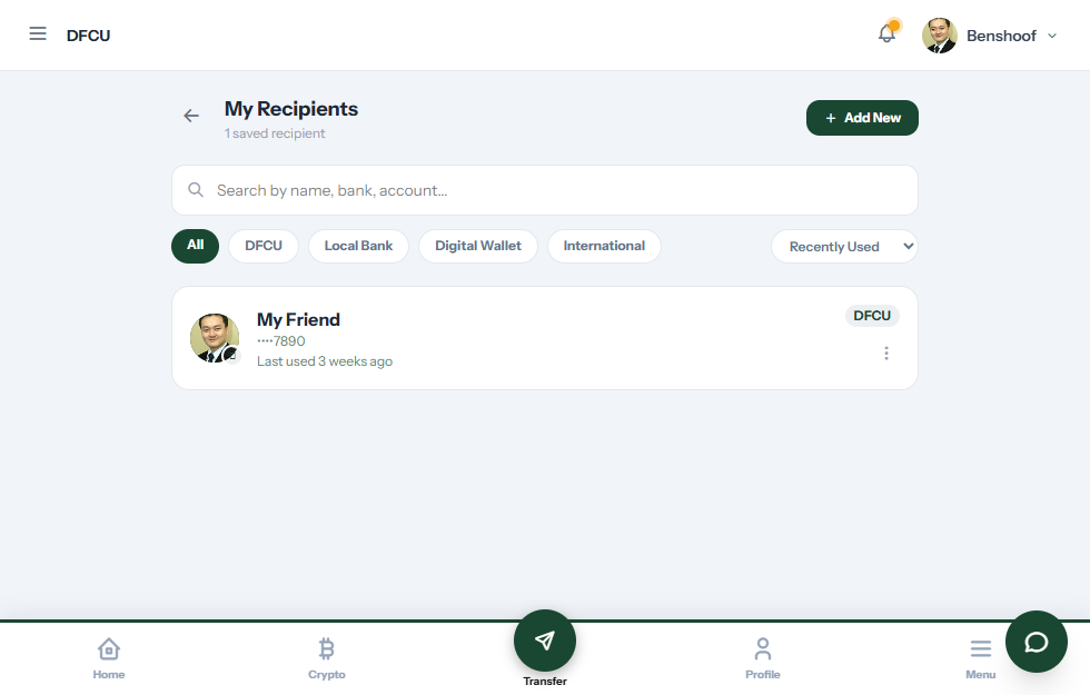
Customers can give recipients nicknames, mark favorites, and reuse them with one tap on every future transfer. It is a small feature, but it is the kind of detail that makes an app feel complete instead of just functional.